Themes & Customization
Personalize the look and feel of Needlework Studio with preset themes, custom color palettes, and light/dark mode.
Some features on this page require the Full Version.
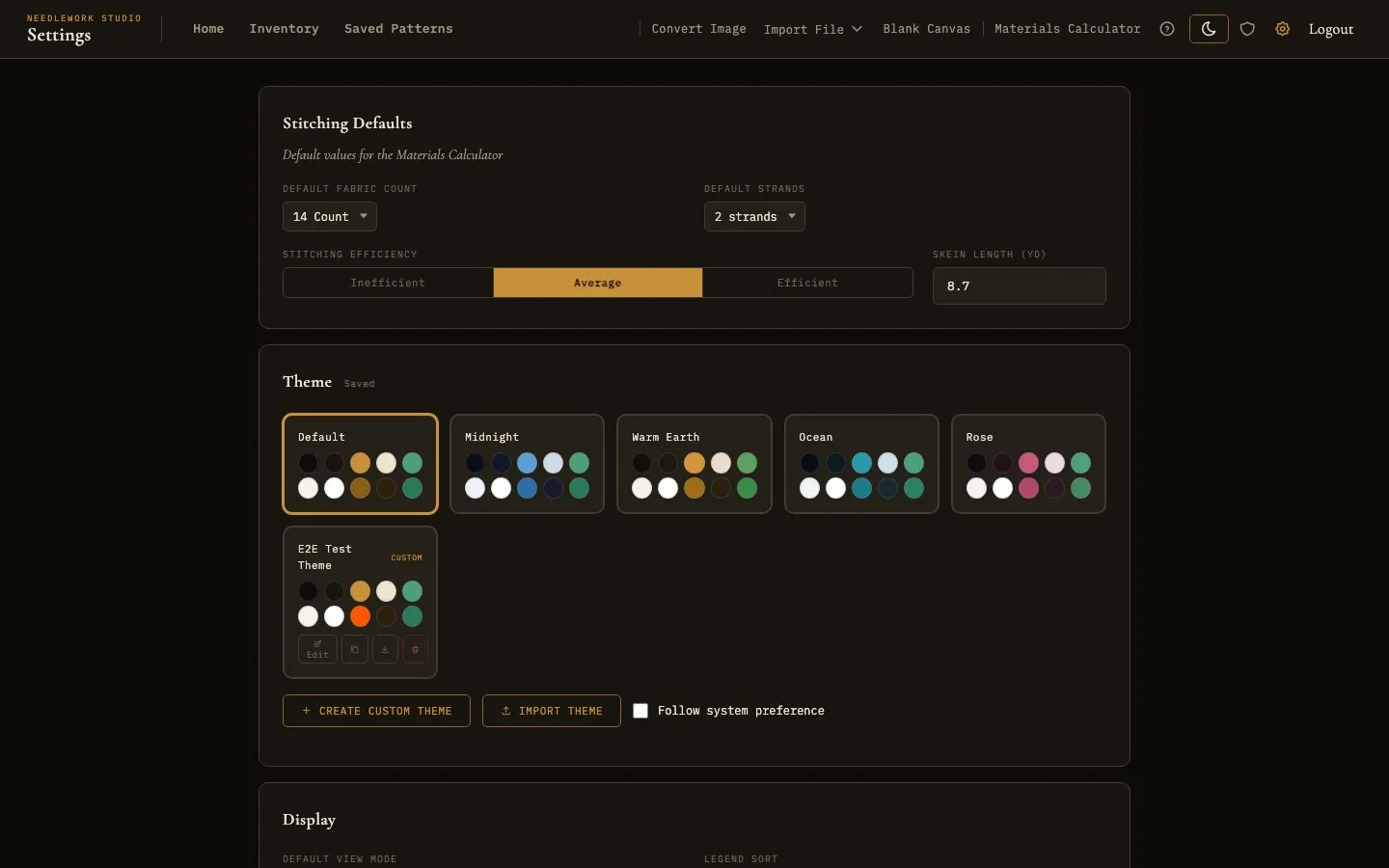
The theme picker in Settings with six preset themes and a custom theme
Overview
Needlework Studio includes a full theming engine that lets you change the entire color palette of the application. Every theme has both a light and dark variant, and you can switch between them at any time using the sun/moon toggle in the header.
Your theme preference syncs across your devices when they share a server account - if you change your theme on the web, it will also update on the desktop app the next time you open it.
Preset Themes
Six built-in themes are included:
- Default - The classic Needlework Studio look with warm gold accents on dark brown or warm cream backgrounds.
- Midnight - A deep navy blue palette with cool blue accents, ideal for late-night stitching sessions.
- Warm Earth - Rich, earthy browns and ambers for a cozy, natural feel.
- Ocean - Cool teal and blue-green tones inspired by coastal waters.
- Rose - Soft pink and rose-tinted hues for a warm, elegant aesthetic.
- High Contrast - A high-contrast accessibility theme (WCAG-AAA) with strong color separation for low-vision stitching.
To switch themes, go to Settings → Theme and click any preset card. The change applies instantly across the entire app.
For accessibility, Settings also includes a dyslexia-friendly font, a plain-sans font option, an adjustable text size, and a reduce-italics toggle.
The High Contrast theme applied to the pattern gallery
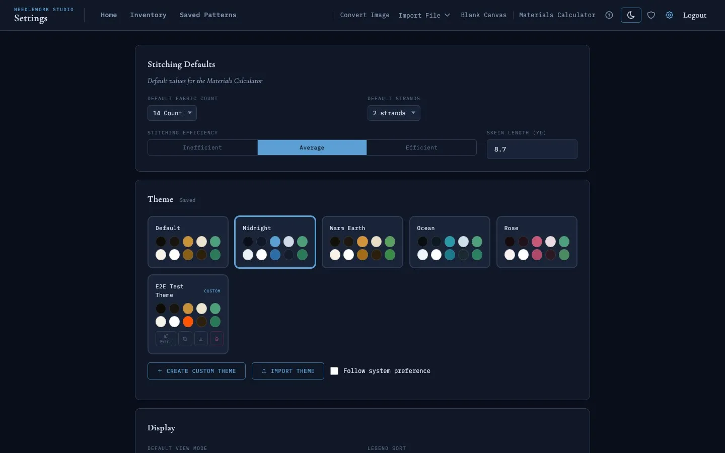
The Midnight theme with its deep navy palette and blue accents
Light & Dark Mode
Every preset theme has both a light and dark variant. You can switch between them in two ways:
- Header toggle - Click the sun/moon icon in the top navigation bar. The icon reflects your current mode (sun for light, moon for dark).
- Follow system preference - Check the "Follow system preference" box in Settings → Theme. The app will automatically switch between light and dark based on your operating system's appearance setting.
If you have "Follow system preference" enabled and manually click the sun/moon toggle, the system follow is automatically disengaged and you stay in the mode you chose.
Creating Custom Themes
You can create your own themes with fully customized colors:
- Go to Settings → Theme and click Create Custom Theme.
- Your currently active theme is cloned as a starting point.
- Enter a name for your theme in the text field at the top.
- Use the Dark / Light toggle to switch between editing the dark and light variants.
- Click any color swatch or type a hex code to change individual tokens. Changes preview live as you edit.
- Click Save Theme when you're happy with the result.
Custom themes appear in the theme grid alongside the presets, marked with a Custom badge. You can create up to 10 custom themes.
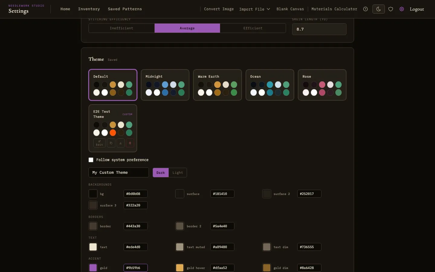
The custom theme editor with grouped color pickers and live preview
Color Token Groups
The color editor organizes tokens into logical groups:
- Backgrounds - Main background, surface layers (cards, panels, inputs).
- Borders - Divider lines and element borders.
- Text - Primary text, muted/secondary text, and dim/tertiary text.
- Accent - The primary accent color used for active states, links, and highlights (plus hover and dim variants).
- Status: Owned / Need / Skip - Colors for inventory status indicators and progress tracking.
Managing Custom Themes
Each custom theme card has four action buttons:
- Edit - Re-open the color editor to modify the theme.
- Duplicate - Create a copy of the theme (named "Theme Name Copy"). Useful for creating variations without losing the original.
- Export - Download the theme as a
.jsonfile that can be shared with others. - Delete - Permanently remove the custom theme. If it was your active theme, you'll be switched back to Default.
Importing Themes
To import a theme someone has shared with you:
- Go to Settings → Theme and click Import Theme.
- Select the
.jsontheme file from your device. - The imported theme appears in your grid, ready to use.
Theme files use the needlework-studio-theme format and include both the dark and light color variants.
Cross-Device Sync
Your active theme, light/dark mode preference, and all custom themes are saved to your account on the server. When you log in on a different browser or the desktop app, your theme loads automatically.
For instant load times without a flash of the wrong theme, the app also caches your theme in the browser's local storage. If the server has a newer preference (e.g., you changed themes on another device), it corrects the local cache on the next page load.
Tips
- When creating a custom theme, start from the preset that's closest to what you want - it saves time since you only need to tweak a few colors.
- Test both the dark and light variants of your custom theme before saving. The Dark/Light toggle in the editor lets you preview each side.
- Export your custom themes as a backup before resetting preferences, since "Reset All Preferences" removes custom themes too.